Farewell to CSSConf AU
Last month I got the awesome opportunity to go to the final CSSConf AU in Melbourne and see a range of amazing speakers from all over the world (including one of my good friends from Perth). This was the first time I’d been to a CSSConf and I’m so glad I was able to make it before they finished up. The entire experience from start to finish was amazing, inclusive, inspiring, encouraging and came close to being the best conference I’ve been to (Mixin still ranks as my favourite conference). Although I didn’t make it to JSConf (I did get to Decompress though), my week was packed with inspiring talks, meeting amazing people and thoroughly enjoying the time I spent in Melbourne (probably about as much as I enjoyed collapsing into bed when I made it home 😂😴).
CSSConf managed to get lucky in that they were earlier in the week before I’d started to get tired (and after I’d recovered from my jet lag the day before) and they got off to a great start. One of my pet peeves with conferences is that they have “plate food” (food that is eaten off a plate) but never have enough/any places to sit and eat. This means that there are often crowds of attendees standing around and awkwardly holding a plate while trying to eat off it.
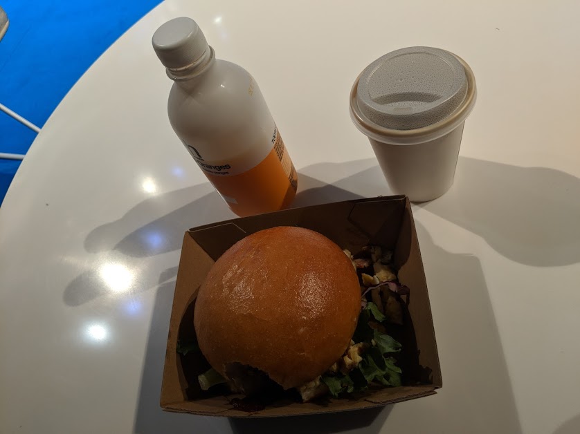
Kicking the day off strong, we were fed a delicious breakfast of “hand food” (something that can be eaten with your hands while standing up) that filled us up, ready to start the day with a breakfast burger and a never-ending supply of barista brewed coffee, fresh juice and other assorted drinks.
One of the things I enjoy most about conferences is meeting the people. The vibe and setup at CSSConf did an amazing job at encouraging this mingling, with a variety of different spaces including couches and tables, and even provided a live stream in the outside area in case you needed a quick breather from everything or had to continue working through the conference.
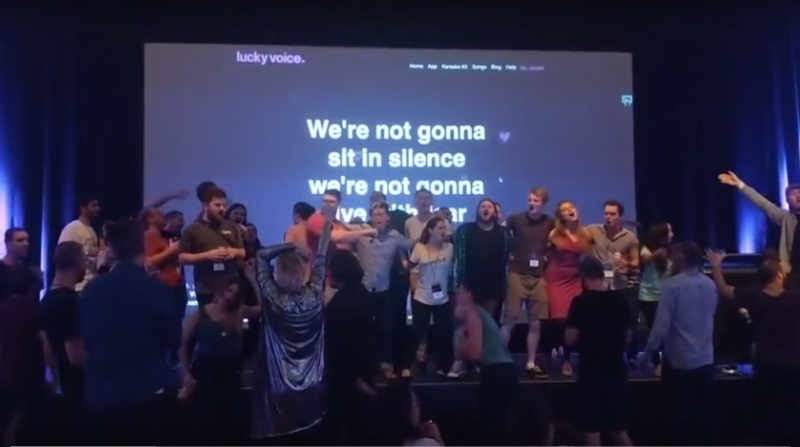
I also really enjoyed having a different approach to the after-parties for the conference. As someone who doesn’t drink, I’ve never felt pressured to do so at conference after-parties, but it was nice to have something else to do at the CSSConf after party. Once the talks were done and dusted (and we’d all had our pictures taken), the main venue was set up with vintage video games (and a couple of modern ones) and karaoke, while the mingling area outside played host to a large variety of board games (both classics and a bunch of lesser known games). This was a great chance to continue to mingle with other conference attendees and speakers (who were more relaxed by this point having done the hard part), meet new people and get a dose of healthy rivalry with various games. This provided a much-more inclusive social option to everyone who was there, and gave a chance to unwind after the long day (and get a couple of photos take in the photo booth outside to remember the occasion).
Behind the Illusions: Impossibly high-performance layout animations
David Khourshid
As I learn more and more about CSS, I’m astounded by how indistinguishable it is from magic sometimes (when it works of course) and David’s talk was a great way to start the day and remind us of the amazing things we can do with CSS that doesn’t compromise site performance and a lot of the time only takes a few lines of code.
CSS is magic! They’re illusions, not hacks
David took us on a magical journey through various animations that we can use to give our site more personality, more wow including how to animation position without including the top/right/bottom/left values, how to animate size without touching the width and height, how to animate our gradients without colour, animate on curves without using a motion/offset path and how to animate the border radius without fear.
But there is power in animation. The power to create experiences that go beyond mere linked documents. The power to immerse users in an illusion of life - Rachel Nabors
How to use CSS grid today in the real world
Brenda Storer
Since I was first introduced to CSS Grid by Andy Clark at my first conference in 2016, I’ve been amazed by what we’re able to do with it and itching to try it out for myself (which I’m currently doing 😄) and I love any chance I have to hear from someone else about grid, what it can do and how they’re using it (it does so many things I keep forgetting the extents of it’s capabilities).
Brenda took us on a futuristic trip showing the truth of browser support (between January 2017 and October 2017 it went from less than 6% supported to over 75% supported) with over 87% of all browsers today supporting the new CSS Grid specification (that seems good enough for me).
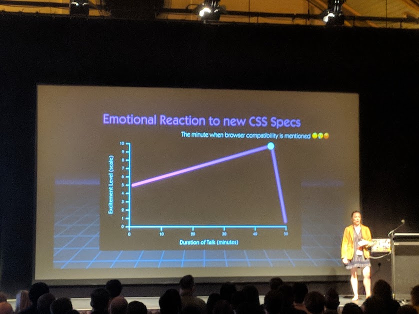
There is a time and place for CSS Grid, and this doesn’t necessarily need to replace Flexbox (I still use both depending on the use case) and grid is really useful for creating 2 dimensional layouts while flexbox still holds a place for displaying items in a row or a column (like in a nav menu). Grid allows you to do some amazing things with layouts and also helps to create responsive layouts that require less code and no media queries!
It’s ok that when I look back at my old code I sometimes say, “Whatever was I thinking?!!” That means I’m still learning and growing - Brenda Storer
Brenda also took the time to remind us that we’re always learning something new, whether it be a new technique, language, framework or even just a new way to write things. This means that often we look back at old code and wonder what we were thinking when we wrote it, but don’t despair because that means we’re growing and learning something new. In an industry as fast paced as the web, sometimes you can get as much out of self-reviewing old code as out of getting a peer to review it; you’re likely a different developer to 6 months, 3 months or even 3 days ago.
Faster fonts for speed fanatics
Jeremy Wagner
With such a huge emphasis on site performance, we’re having to look at everything we can do to help reduce site size, page load time and network requests. This has meant we now combine and minify every file, load scripts and styles inline where possible, compress and optimise every image so it’s not even a pixel bigger than it needs to be and put everything on a CDN with the dial turned up to the max. But Jeremy showed us that we’ve likely forgotten one asset included on every site that is slowing us down - fonts.
While most of the world has pretty decent internet (except Australia), sometimes you might be dealing with a site that is being delivered to a customer who has a low data quota or a very slow speed, and they don’t care as much about the custom font you’ve hand picked and delivered to the site. Google (and a few other providers) are now allowing users to enable “data-saving-mode” which allows developers to select which assets they deliver depending on whether data-saving-mode is turned on. This can be as simple as checking for it, and adding a class to start loading additional assets (fancier fonts, bigger images, etc) if it isn’t. The secret is, most of the time the customer won’t notice or care about the different font and they may just appreciate the faster load time or the little bit of extra data they now have.
There are also various other methods of looking after your users, whether that be by setting font-display: swap to display a locally installed font until your font loads, hosting fonts on your own server so the browser doesn’t have to go and look for them somewhere else and reloading fonts where possible. Jeremy also finished off the talk with a very important reminder to remember the licensing agreements for fonts as a lot of work has gone into creating this resource for you to use.
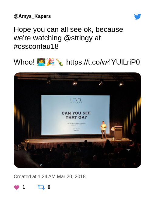
Can you see that OK? CSS tips for low-vision accessibility
Julie Grundy
I’m a little biased when it comes to Julie’s talk, she’s an amazing part of the community we have in Perth and it was amazing to get to see her give her first conference talk in Melbourne (even better to see her nail it).
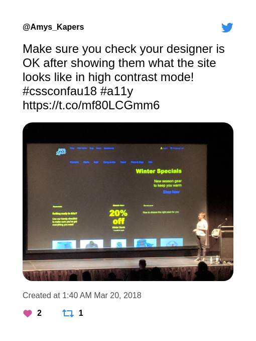
Having spent a fair chunk of her career in accessibility, Julie went through some of the simple CSS tricks that we can use in our day-to-day development to not just make it better for people with vision impairments, but make it a better experience for everyone. More than 9% of Australians have some form of diminished vision and would benefit from (and appreciate) just a couple of small tweaks; and the rest of us would just appreciate it when trying to look at a site while outside in the sun or when there’s a lot of glare.

It was reassuring to hear some of Julie’s tips as techniques that I already use (like using em values rather than px for media queries to make it responsive), but there was something to take home for even the most experienced developer. Properties like text-decoration-skip-ink allow underlines to skip low hanging letters and not only add a little design flair, but make it easier for dyslexic susers to read the text (and making sure to keep the underline for links in case the user has enabled a high-contrast mode on their computer).
a {
  text-decoration: underline;
  text-decoration-skip-ink: auto;
}
We don’t necessarily know who is going to be accessing our site and how they want to use it, so the best thing we can do as developers is to make sure that anyone who wants to do something weird with the site can do so (even if that means destroying the perfectly crafted colour scheme with a high-contrast mode).
Interaction of Colour Systems
Diana Mounter
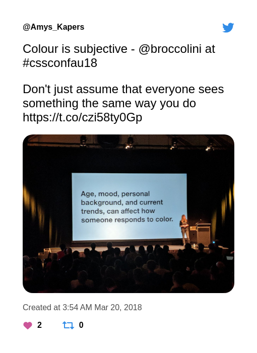
One of the things I admire most about the work that designers like Diana do is the attention to detail they have about the difference between different colours, the way they interact with each other and how different user groups might react to them.
And lets not forget that she reminded us it’s ok because everyone is like this when working from home 😂.

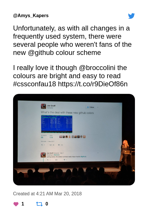
When coming up with a new colour system for GitHub, there were so many differing factors to take into account, including whether people would still recognise different buttons/sections/features when a colour was changed, whether there were too many colours being used on the site, whether they were accessible and the most important - how would the user base react to the change?
Effective Design and Engineering Collaboration
Theresa Ma
Theresa’s talk was really interesting from more of a psychological point of view and addressed the different issues you have communicating with a team and between teams, particularly when they are extremely large and span all across the globe. Working through this often means defining a “language” to be used (and no I don’t mean English) and making sure everyone is on the same page.
One of the biggest road blocks we have when approaching this situation is we see everyone else as “one of the others”, someone who we don’t know and assume is probably doing it wrong or is the source of confusion. Challenging us to meet some of these people we don’t know at work, Theresa walked us through her journey through developing a more standard language at Yelp.
Go get a coffee with a designer or engineer you don’t yet work closely with.
Working with designers, web developers, iOS developers and Android developers across teams, Yelp found that everyone had their own terminology for components on the Yelp platform. An Alert to one team was a MessageAlertBox to another and a BannerNotificationView or a Page Alert to someone else. Imagine trying to work with another team and realising that you were both talking about the same thing even though you were using different words?
We need to start playing nicely as a team (and with other teams), if we work together and make sure we’re on the same page right from the beginning it makes things much easier.
Journeys: What makes a developer, really?
Ivana McConnell
I’ve started this approach to conferences where I read the talk descriptions right back at the beginning when I get my ticket, but then I don’t read them again. By the time I get to the conference I’ve usually forgotten what the talk was about (unless the title is really memorable or suggestive) and I can go in with an open mind and see what happens. I’d spoken to Ivana a couple of times before her talk and hadn’t discussed what she was talking about so I was so happy to be blown away by her presentation.
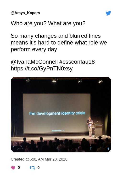
With the web changing so quickly and so many lines between languages and jobs being blurred, it’s getting hard to define what role we perform each day. Am I a front-end developer, a CSS developer, a JS developer, Full-stack, UX/UI, designers, developer, engineer, the list goes on and on (this is why I’ve started listing my job title as “Front End Jedi” 😂)

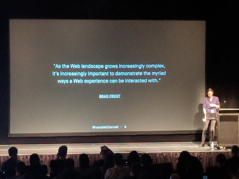
We used to have a clear-cut line between CSS as presentation and development as the function and interaction of the elements, but now CSS is the presentation and the interaction, experience and access. The mind-set that CSS is “easy” and “not a real language” still exists in developers these days, but CSS is getting more and more complex every day.
As a primarily CSS developer at the start of my career, I’m starting to experience these people who disregard what I’m doing as “real development” or insist that someone else could do just as good a job because they’re a “real developer” and “anyone can use CSS” and it was really good to see someone stand up at a conference and remind everyone that we shouldn’t disregard someone else’s language (although hopefully everyone at CSSConf had a healthy respect for CSS).
When you code CSS, you’re writing abstract rules to take unknown content and organise it in an unknown medium - @keithjgrant
In the industry that changes every day, we’re also starting to notice that some of it stays very “same same”, whether it be an team that insists on continuing to do things a particular way, a company that insists on hiring people who’ve completed a particular journey as a developer (eg. studied a computer science or software engineering degree) or an organisation where every team member looks and thinks the same way. Ivana raised an amazing point in her talk, that different journeys mean a different perspective, and oftentimes this different perspective and change from “how we always do things” is what a team needs to go from average to amazing.
I spent Ivana’s talk being inspired and amazed and thoroughly enjoyed listening to someone remind me that we’re all working together and trying to make a change to the industry. It addressed a serious issue, but didn’t bog down in the negatives (the final talk for the day is a tough spot to deal with) and came out inspiring and positive, reminding us that there are others out there trying to change it too and if we continue to work together we can make the web a much more pleasant place to work.
